Here’s your code example in the editor. I don’t personally think the difference between the 'm’s is super noticable. But what did strike me a lot more is the difference in height between the two 'i’s in the first line. I think that difference is pretty bad.
It looks like it’s not an actual height difference, but the smaller width makes the second i look significantly smaller than the first, also implying a lower height.
If the streching is so small as to be unnoticable (and I agree it’s pretty subtle) then I also don’t really understand the benefit.
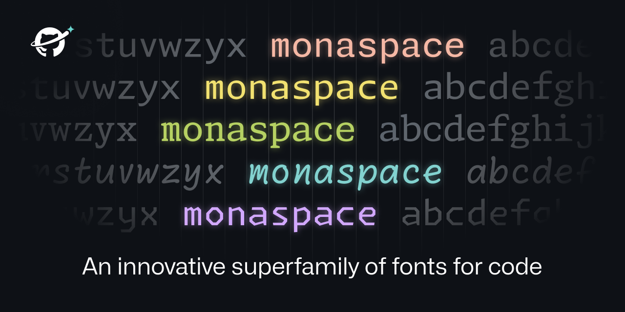
Typically, the idea behind this sort of design is that it should be unnoticeable. The motivation is that, with other monospace fonts, the differences in character width, along with the inconsistent spacing and line thicknesses are both noticable and distracting. Some of this badness is avoidable, and this is what this font attempts.
and yeah that height difference is really weird. That almost seems like a bug.
I’ve been informed, (and had to double check because I didn’t believe it,) that the two "i"s are actually the exact same height. The first looking larger than the second is an optical illusion. Font design is hard.
Eh I don’t really buy the noticeable argument. Either it’s not noticeable both ways (doesn’t matter that m is squished all the time) or it’s not noticeable both ways (expanding m doesn’t align and it’s noticeable and annoying).
Optical Illusion
Wait no, its the fault of the stretching! I mean yes, the i’s are the same hight (which is shocking, thank you for correcting us on that) but the reason it’s an optical illusion is because the i on the left is wider and wide m exaggerates the thinness of the i on the right! Turn off the stretching and suddenly the i’s look the same height.
Edit: I see someone else already pointed this out
This is what I meant by “feeling like my editor is gaslighting me”


Here’s your code example in the editor. I don’t personally think the difference between the 'm’s is super noticable. But what did strike me a lot more is the difference in height between the two 'i’s in the first line. I think that difference is pretty bad.
It looks like it’s not an actual height difference, but the smaller width makes the second i look significantly smaller than the first, also implying a lower height.
True, they are the exact same height. Holy optical illusion, Batman!
I suppose this is part of what makes font design so difficult.
Welp, another reason I will absolutely not be using glyph-streching or whatever Microsoft called it.
thanks for rendering that! and yeah that height difference is really weird. That almost seems like a bug.
Also Idk if the ='s make the m smaller or bigger.
If the streching is so small as to be unnoticable (and I agree it’s pretty subtle) then I also don’t really understand the benefit.
Typically, the idea behind this sort of design is that it should be unnoticeable. The motivation is that, with other monospace fonts, the differences in character width, along with the inconsistent spacing and line thicknesses are both noticable and distracting. Some of this badness is avoidable, and this is what this font attempts.
I’ve been informed, (and had to double check because I didn’t believe it,) that the two "i"s are actually the exact same height. The first looking larger than the second is an optical illusion. Font design is hard.
Eh I don’t really buy the noticeable argument. Either it’s not noticeable both ways (doesn’t matter that m is squished all the time) or it’s not noticeable both ways (expanding m doesn’t align and it’s noticeable and annoying).
Wait no, its the fault of the stretching! I mean yes, the i’s are the same hight (which is shocking, thank you for correcting us on that) but the reason it’s an optical illusion is because the i on the left is wider and wide m exaggerates the thinness of the i on the right! Turn off the stretching and suddenly the i’s look the same height.Edit: I see someone else already pointed this out
This is what I meant by “feeling like my editor is gaslighting me”