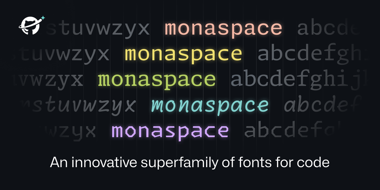
Neon and Argon: Seem okay. They’re really quite similar though. It’s like the designers couldn’t decide which they liked more and so just decided to release both.
Xenon: It feels alright. The horizontal serifs give everything a more uniform look, but you can also get that with any other serif font.
Radon: Uh, no thanks. It’s like someone took the weird letters from Dank Mono and said “what if we did that but for the whole font?”
Krypton: What if we just took OCR A and added ligatures? Alternatively, “Floating Point Precision Error: The Font”
Overall, none of these are compelling enough to make me want to try them. I quite like the Texture Healing feature, but it’s not enough to make me want to move to it.
Also, using multiple different fonts in one code file sounds horrendous.
Some might. I using Comic Code and Fantasque Code from time to time as it forces my brain to reinterpret “known” code and helps to find errors that way. It also help with minor dyslexia moments.
I like Radon, except I fully hate how “i” character is looking it is a “z” with a dot on it. If there were variant with normal “i” I would consider using it.
It’s a stretch, but the only thing I can think of is that it might be a bit better for dyslexic people because the letters are a bit more diverse, but I don’t think it’s nearly enough to be considered an actual dyslexia font.


Neon and Argon: Seem okay. They’re really quite similar though. It’s like the designers couldn’t decide which they liked more and so just decided to release both.
Xenon: It feels alright. The horizontal serifs give everything a more uniform look, but you can also get that with any other serif font.
Radon: Uh, no thanks. It’s like someone took the weird letters from Dank Mono and said “what if we did that but for the whole font?”
Krypton: What if we just took OCR A and added ligatures? Alternatively, “Floating Point Precision Error: The Font”
Overall, none of these are compelling enough to make me want to try them. I quite like the Texture Healing feature, but it’s not enough to make me want to move to it.
Also, using multiple different fonts in one code file sounds horrendous.
Radon, the “handwriting” one, seems like if someone wanted to have Comic Sans but for code.
Comic Code is a thing and it’s 10/10. It’s proof that handwriting style fonts for code is possible.
That’s exactly how I thought, I’m not a dev myself but are there really people who might use a font like this to code?
Some might. I using Comic Code and Fantasque Code from time to time as it forces my brain to reinterpret “known” code and helps to find errors that way. It also help with minor dyslexia moments. I like Radon, except I fully hate how “i” character is looking it is a “z” with a dot on it. If there were variant with normal “i” I would consider using it.
It’s a stretch, but the only thing I can think of is that it might be a bit better for dyslexic people because the letters are a bit more diverse, but I don’t think it’s nearly enough to be considered an actual dyslexia font.
I would, just to have something different in my setup for a while. It gets boring when everything looks the same year after year.
I think Xenon with it’s small serifs looks a bit like SimSun, but with better kerning