

The way they talk about it makes it sound like they invented the written word, but that notwithstanding the fonts actually look really nice in my opinion.
The way they talk about it makes it sound like they invented the written word, but that notwithstanding the fonts actually look really nice in my opinion.
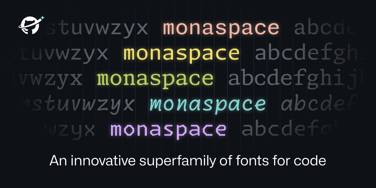
Will they replace Consolas in Windows with this one or is it a GitHub-only-thing? In Consolas the characters
1andllook very similar, making the font unsuitable for coding and terminal use, so it would be good if they replaced it with something else.Anyone who makes a font where
Iland|are not immediately distinguishable should be barred from working in the industry.I hate Arial as much as a person could possibly hate a font for this exact reason.
Unfortunately this new font family still struggles with the l1 issue,in all but the last two typefaces. There’s a lot of good ideas here, and the Krypton version isn’t too bad, but I still struggle to see why they haven’t figured out that gaping issue on most of the styles here.