

The way they talk about it makes it sound like they invented the written word, but that notwithstanding the fonts actually look really nice in my opinion.
The way they talk about it makes it sound like they invented the written word, but that notwithstanding the fonts actually look really nice in my opinion.
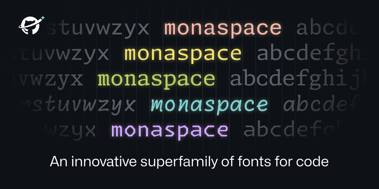
I didn’t think I had strong opinions on fonts.
Turns out I viscerally despise “handwriting” fonts. They’re harder to read. It just makes me recoil.
I also intensely dislike "ligatures " that turn like
==into a separate glyph. Or the one that turns>=into the > with the line under it. No. Stop. That’s not what I typed. That’s not what I’m looking for when I scan the text.Side note: I assume someone is feeling clever and is thinking of replying with a handwriting font message with ligatures. You don’t have to. I already imagined it.
The texture healing seems cool though, but I didn’t immediately notice or understand until I read through the detailed section on it.
I personally like ligatures when I’m programming. It took me some getting used to, but now I can’t live without them due to how distinct it makes the code segments. I fully understand disliking them though. Thankfully fonts like source code pro allow disabling features like ligatures and their godawful handwriting styled italics, so you’re able to use just the parts you like.