cross-posted from: https://lemmy.blahaj.zone/post/1312795
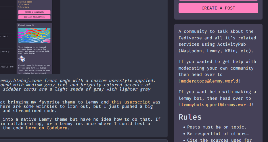
[Image description: A screenshot of the lemmy.blahaj.zone front page with a custom userstyle applied. The userstyle features a dark gray background with medium gray text and brightly-colored accents of purple, pink, orange, and cyan. The right sidebar cards are a light shade of gray with lighter gray text, pink buttons, and orange links]
A few weeks ago I decided to try my hand at bringing my favorite theme to Lemmy and this userscript was born. It’s still in the early stages so there are some wrinkles to iron out, but I just pushed a big update with better contrast, style fixes, and streamlined code.
I’ve received several requests to turn it into a native Lemmy theme but have no idea how to do that. If anyone has any tips on theming, interest in collaborating, or a Lemmy instance where I could test a native theme, hit me up! You can find all the code here on Codeberg.
This looks great and I love Dracula! Thank you!
If you wind up doing this for Catppuccin as well let us know, that’s what I migrated from Dracula to a couple months ago.
I don’t have plans for a Catppuccin theme, but someone else asked about it on my last post and I found a theme on Github: https://github.com/n3oney/catppuccin-lemmy
+1 for Catppuccin, it’s my all-time favorite theme and I would love to see it here!
Nice!
This is awesome! is there a compact version? my sidebar is a bit small in browser atm

There is no compact version at the moment. Is the sidebar much smaller in comparison to a native theme in your browser?
no it’s the same size on the normal version, I think the font and the fact I use darkly compact normally makes it seem a bit squished to me
YEEEESS THANK YOU! I run Hyprland with everything Dracula as well as GitHub, YouTube, DDG, and other websites.
Please (if you want) make a PR to the official project, that way your (awesome) work can show up directly on draculatheme.com.
Also are these
 bordered corners intentional? Never noticed them on the default theme.
Never noticed those bordered corners either, good job spotting them! I just pushed a fix to the stylesheet. I’m not on Github so I’m not sure this theme will be showing up on the official site. If anything I would at least wait until the native Lemmy theme was ready to share.
I tried it and liked it when I saw the first post about it, it wasn’t perfect but looked nice, I stopped using it mostly because I am a Safari user lol (yeah, shame on me).
Yeah it sucks that there are no free user style extensions for Safari, sorry ☹️


