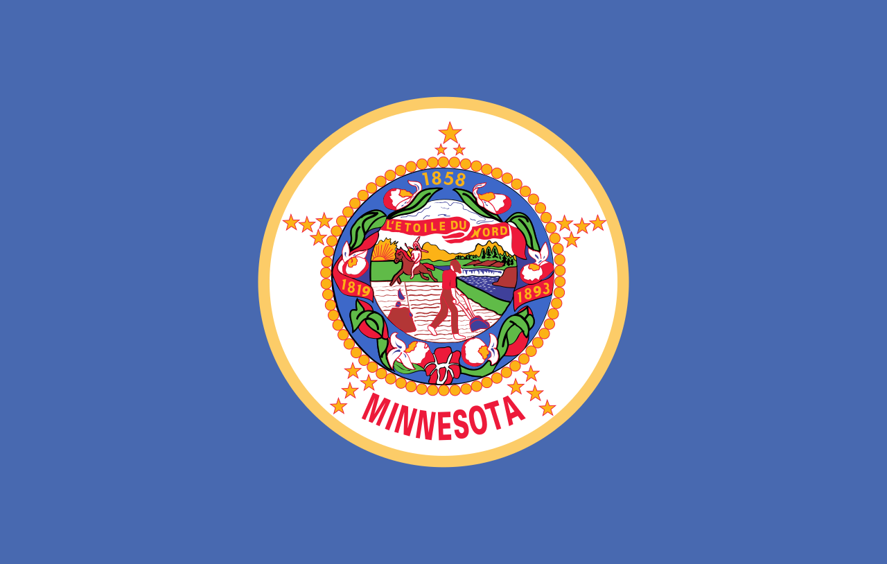
The current flag looks like this, which obviously needs changing:

There is a commission tasked with proposing a new design. A news article about it is available here: https://www.cbsnews.com/minnesota/news/minnesota-house-bill-moves-forward-commission-to-redesign-state-flag-and-seal/
The top proposal, called “The North Star Flag”, seems to be a popular favorite.
I gathered these proposals from these two sites: https://newmnflag.org/designs https://vexillology.fandom.com/wiki/Minnesota


#4 is my choice. Very clean, it’s an easily recognizable design, and it seems more creative than just “Nordic cross with star” or whatever the abominations in the later half are.
The pattern is called Selburose and is a traditional pattern used in knitted mittens and sweaters from the area of Selbu located in Norway at the border to Sweden.
I thing #4 is by far the nicest flag
Number five gets my vote. The light blue with a nice star and the swirls , it’s the perfect sign for a flag