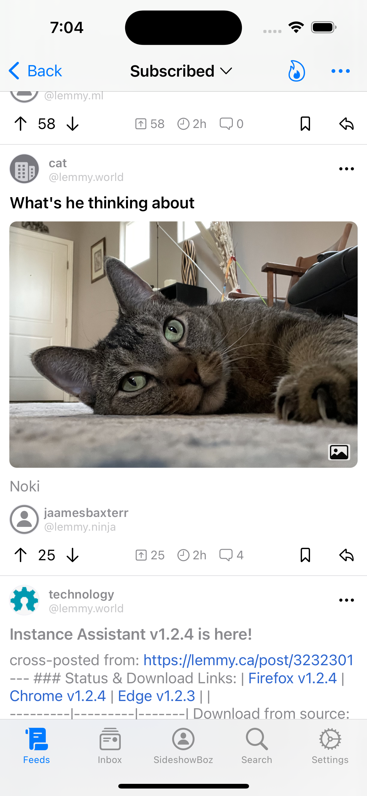
I love this app, and keep coming back to it after testing other apps, too.
However, I find myself tapping thumbnails which I think are images, which instead open another site. Maybe it is my way of browsing, but I have noticed that other apps I display the content type, which makes for a more desirable browsing experience for me at least. Is this something that is in the works?
I think displaying icons would be more of a crutch than a solution, different things should look different, without the need for an explicit “label”.
Regarding tapping the images, there‘s probably going to be an option to have them expanded in the feed and shrunken by default (instead of being cut off), which might help with that confusion a bit.
I believe this comment is referring specifically to thumbnails in compact and headline mode–large posts already distinguish between images and links by embedding the link preview in a complex with the url and website icon.
Ahh I see what you mean, that makes sense. In that case I think an icon is fine :) I was talking about the “large post” size as you said
Something (not exactly) like this? Can’t remember exactly which apps (not exactly Lemmy apps) already do this, but standard Lemmy UI does this.

Yeah. Like Memmy does this overlay for links

It’s James Baxter oh my gosh
We’ve got an issue open for it, should be out in the next build. Chances are we’re just going to implement what Apollo did and Memmy currently does where link thumbnails get a little icon overlay, but we’re always open to new ideas if anybody has them


