
First, I’d like to thank everyone involved in KDE for building such a great DE!
One of the features I love about KDE is the ability to have a multiline Icons-and-Text Task Manager. However, I think it could be improved even more. I wanted to share my thoughts and see what others think.
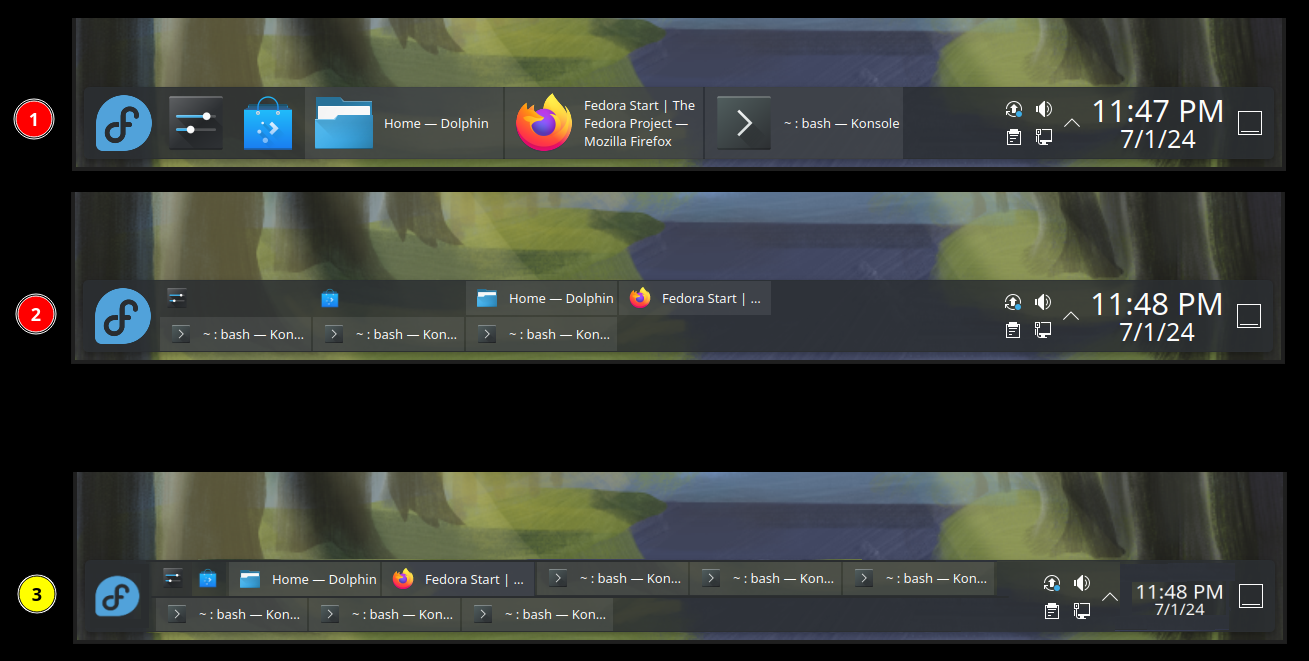
Please consider the attached image. In ① and ② we see what the taskbar looks like when ‘Maximum rows’ is set to 2. And ③ is a sketch I quickly made to illustrate what I am thinking of. In short:
- I imagine a layout that is more space-efficient and one that doesn’t try to look like a grid. Pinned icons don’t stretch.
- Instead of ‘Maximum rows’, we just have a fixed number of rows. And when the opened applications are just a few and they can fit in a single row, I think it would look better if they didn’t stretch and take up all the vertical space available, but just take the first row and leave the second one empty.
- If the Digital Clock and the Application Launcher icon could somehow be made smaller, there would be even more free space for other useful stuff and the taskbar would (arguably) look better.
What do you folks think?
You must log in or register to comment.
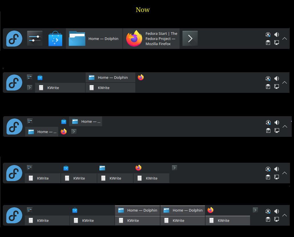
To further illustrate my point, here are some more screenshots of the current layout:
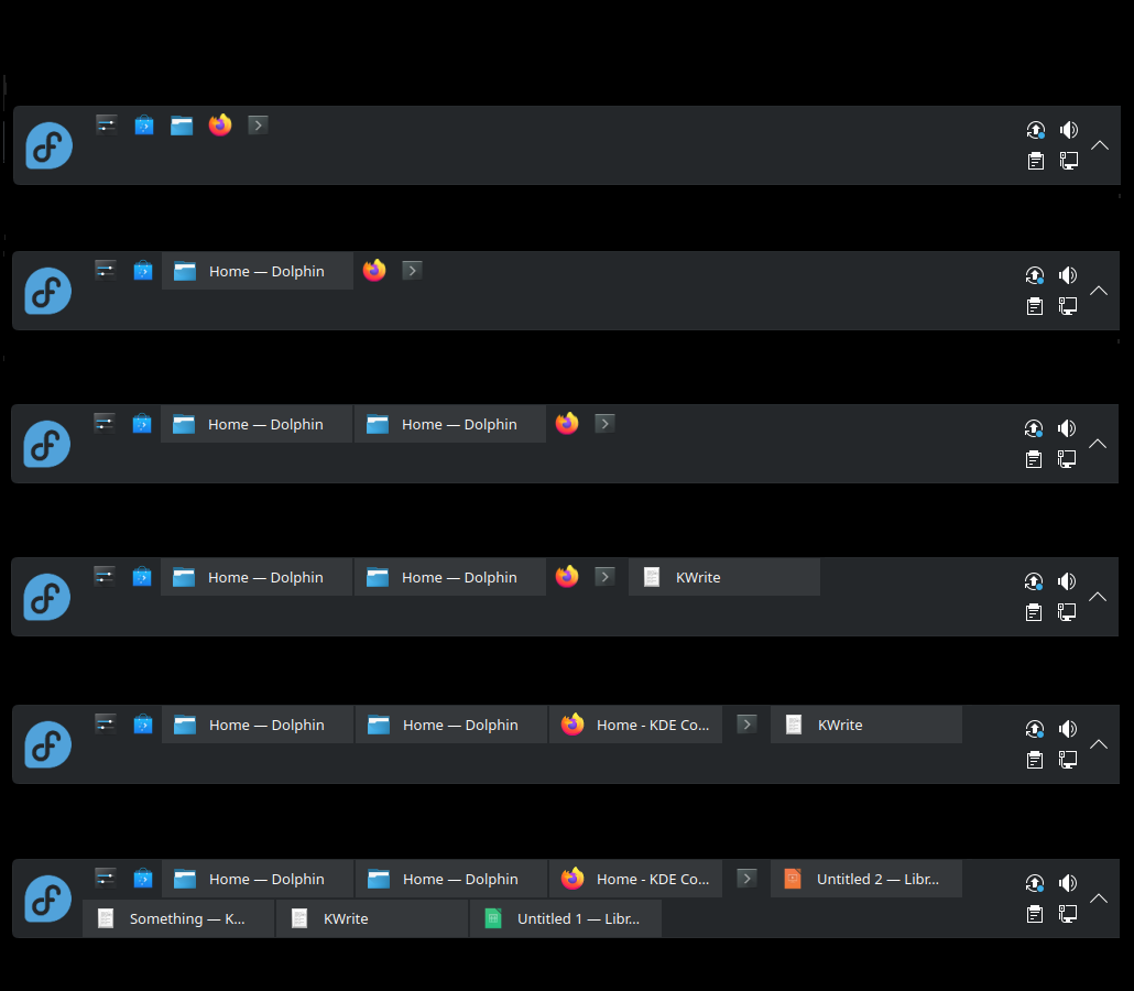
As well as what I think would look better:
This is a completely different perspective from the current “grid” layout. The idea here is:
- We have exactly N rows.
- We have a list of “items”, where an “item” is either a pinned (unopened) icon or a button for an opened application/window with a title (will call it “button” here for short, can’t come up with a better term).
- The row height should never change while opening/closing windows (applications).
- The width of (unopened) icons should never change.
- The width of “buttons” should be determined dynamically, depending on the number of items and space available. But I imagine that it should start from something like 300 px - something that could be considered wide enough to display “enough” of the title text (maybe ‘px’ is not the best unit, but just to illustrate the point), and only decrease the width when needed (i.e. no space left).
- In the simple case when
N=1, let’s say the available space is with widthWunits, there arePpinned icons and their width isKunits, then the available space for all “buttons” could be calculated with something likebuttons_total_space = (W - (P*K)). To get the target single button width, we could do something likebutton_width = min(300, buttons_total_space / buttons_count)(not sure if the case of “too smallbutton_width” should be handled in any special way - IMO probably not worth it). - To handle the
1case, the formula would become more complicated of course, as it would need to account for different available horizontal space in each row and figure out how many buttons to put in each row. For example, ifN=3and we have 8 pinned unopened icons, they will probably fit in the first row. Then we might end up with, say, 480px left in the first row and 800px in the other two, so if we need to distribute 10 buttons, we might decide to put 2 buttons (with width 240px) in the first row and 4 buttons (with width 200px) on each of the remaining 2 rows.
- In the simple case when