Hey Rat Punchers, Happy New Year!
As always, I like to write a blog post at the start of the year to recap, summarize my current plans for Shattered, and share what my main priorities are for the coming year. This post starts with a year in review, and then lists the major changes and additions that I have planned for Shattered Pixel Dungeon in 2026 and beyond!


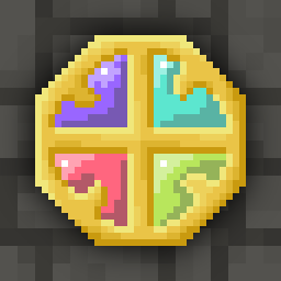
I agree. I don’t like the new scroll art at all, or the stones, or the dart tips (fletching looks good, though). Nor do I like the new crystal chest. It looks like a face.
The runes on the stones look too bold, and the enhanced scrolls look too glossy or faded. The dart tips are too fat.
@Quibblekrust
Agreed. What disturbs me about the scrolls is that symbols have moved from clear and legible to wiggled and harder to recognize.
For enemies, wands, or potion bottles a little more 3d is ok and looks good, but for the scrolls and runestones it is a downgrade. The symbols are their distinguishing feature, so they should be kept clear.
Also, bottles and seeds have their colors to tell them apart, wands have different colors and shapes, so tweaking their 3d does n
@notabot
@Quibblekrust
Also, bottles and seeds have their colors to tell them apart, wands have different colors and shapes, so tweaking their 3d does not affect their recognizability, opposed to the scrolls and runestones.
@notabot
Counterpoint on darts specifically: the fat tip can be for tipped darts. Currently, blinding dart looks way too similar to the untipped dart; fattening the tips on tipped darts is one solution.